Well, I certainly annoyed some people simply by reporting on data received from Ontario’s Ministry of Long-term Care. It was in a column published in Wednesday’s Toronto Sun where I looked at the average number of deaths per month in LTC settings across the province.
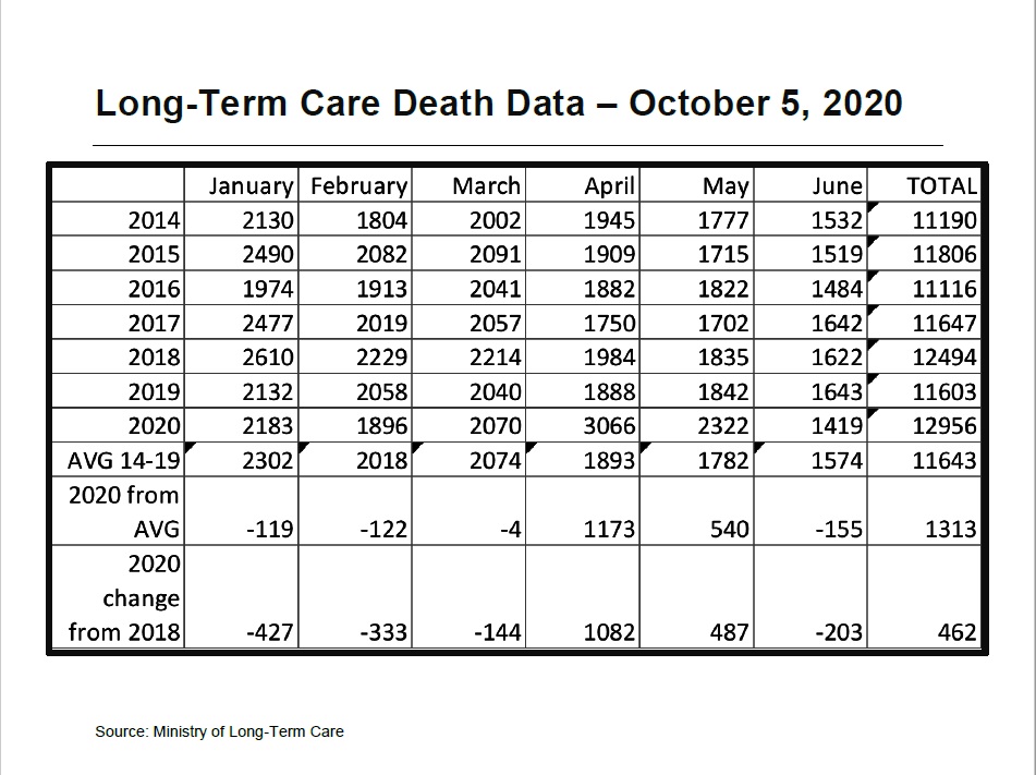
While April and May of 2020 were extremely bad, something we already knew, the first six-months of the year are not that far above a bad flu year. We had one of those in 2018 and when January through June of each year is compared, 2020 is 3.7% higher in terms of death than 2018.
I had journalists, people who supposedly want facts and the truth out there, screaming at me on Twitter. There were claims that I was too much of a simpleton to understand the data or that there is no comparision, or a dangerous comparison to be made there.
Look, I’m not arguing that COVID-19 is the same as the flu. That’s not the point of my column. I looked at death rates.
It was a chart in a document put out by the Long-term Care Commission that piqued my interest, it showed deaths spiking higher and then fading off. This same document though also showed the number of deaths per month in Ontario’s LTC homes.
To me, the numbers were high. We never hear about losing 1,800 to 2,000 people per month in these locations yet that’s what the figures said.
So a few weeks ago I asked the ministry for the numbers for the first several months of 2020 so that I could compare them. I got those numbers on Tuesday and wrote the column.
Yes, I understand that flu season starts in the fall and runs through the winter. Yes, I know that we took extraordinary measures to deal with COVID-19.
None of that makes looking at the data for the first six months of the year and comparing it to past years invalid. It is simply one metric.
My take away from the criticism that I’ve received so far is that they simply don’t want this information out there and under no circumstances should any comparison to the flu be made.
There is lots more to learn from these numbers, and the other data provided by the province on a daily and weekly basis. For those who care to look, here are the documents. The photo is the most pertinent chart, the rest of the document is available below.